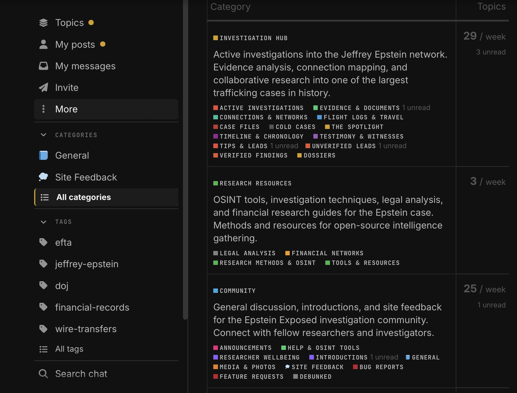
The new All Categories site is currently pretty hard to visualise, and appropriate channels hard to spot/find. Text too condensed, small, crunched to the eye, hard for the mouse to grab. Could the top headlines instead be large “widgets”, leading into a new page with all those sub-headings?
While on this topic, at least on my screen I see a neatly identifiable “General” and “Site Feedback” top headings on the left-hand column with visible icons, but the “All Categories” is with a smaller font and a less noticeable icon. Given this is the most important category, shouldn’t it be raised to the top with a clearer icon, same size font, and leading into a neatly arranged catalogue of widgets for the sub-headings?
…Just a thought, I appreciate this may look very different for other people based on their computer/phone models and browsers. ![]()